Interactive Table for Experience Store
Role: UX Lead
Artifacts: Service Design, UI Redesign, Interaction Standards, Pattern Library, Personas.
The Challenge
Synopsis: The client, a leading foreign telecom, approached the team with the desire to create an Apple-like end-to-end in-store experience for key markets in their country. The store was meant to highlight their devices and plans via a set of interactive 'experience tables' and wall displays, as well as having staff on hand to answer any questions or take transactions.
Leading with a technology before understanding a need can be tricky: Though the client had pinpointed the technology that they wanted to deploy in the stores, they had no fixed ideas about what should be done with the displays–or what the UI's should do. The team was introduced to the problem and told to figure out a solution...with a hard deadline for two weeks prior to the unveiling date.
The Work
Service blueprint of experience table
Research Work
Subject matter expert and customer interviews.
Design research of inspiration pieces, competitor experience projects and widely understood gestures.
Pattern testing with end-users and surveys for regular feedback.
Design Work
Service design for both direct sales funnel, and long-term engagements.
Wireframes
Pattern libraries
Style guides.
Functional prototypes.
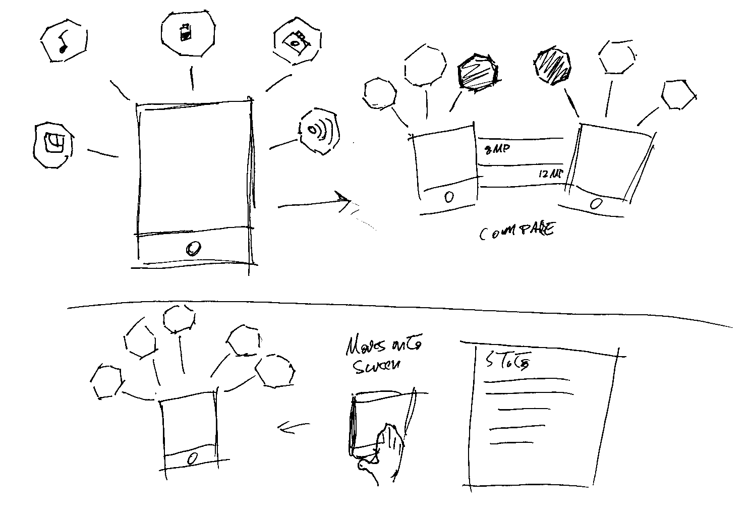
Top - Concept diagram for "molecules".
Bottom - Finished product in Australian telecom experience store.
(Click to enlarge)
Because the value proposition was so heavily tied to the technology, we wanted to take a step back and validate the problem paradigm and goals. What we came back with was:
Personalize interactions with customers to set the telecom apart from its competitors.
Convert experiencers to customers using a long-tail strategy.
Engage and delight everyone who walks through the door.
To begin designing, we used our customer journey maps, and investigated which gestures would be most likely to be used at each stage. We created a baseline document of familiar gestures, then used that as a springboard to improvise and design new gestures. Then each round was user panel and tested along with calls to action. After a few iterations a new baseline of 'familiarity' was established.
Top - Concept diagram for device comparison.
Bottom - Finished product in Australian telecom experience store.
(Click to enlarge)
With common gestures and solid parameters in place, we began to experiment: UX designers and UI designers were paired into teams and assigned a specific table or wall, and told to work through concepts. Our team was tasked with the device comparison table.
We then partnered with UI designers and examined the stages of the customer journey, assigning a corresponding screen to each stage.
As we conceptualized the UI design goals, we landed on the idea of using modular information 'molecules' to inform the user and prompt them to interact. For example: If a user places two devices side-by-side on an interactive table, a cloud of virtual 'molecules' would form around the real-world devices, which display specs and actions that can be taken. During the entire experience, a user could scan a QR code or tap an RFID card to save the molecule configuration portable for an in-store purchase, or further exploration at home.
The Response
Company executives exploring the interactive table on opening night.
(Click to enlarge)
Results started to come in too. In the first 60 days, it was estimated that conversions were around 44% higher for customers who explored using the experience-store, and the saved configuration cards.
The response to the experience store was overall incredibly positive. In fact, the two key locations boasted lines around the door for a full two weeks following the opening of the store!